Posted 27th May
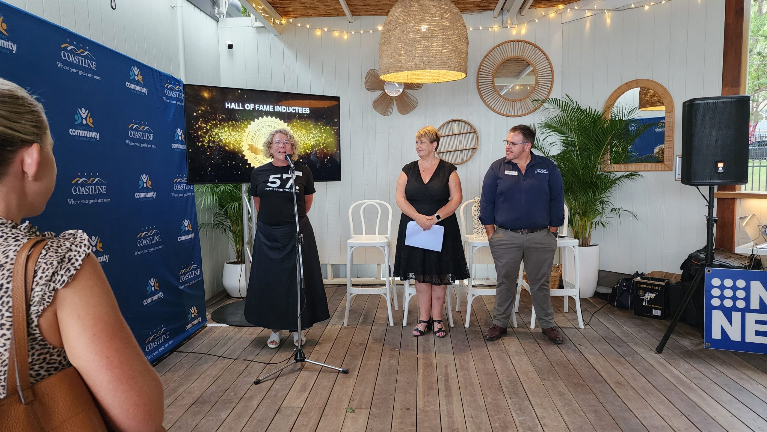
One of the highlights of Reconciliation Week 2022 was the launch of Liberty’s new visual branding on Friday 27 May.
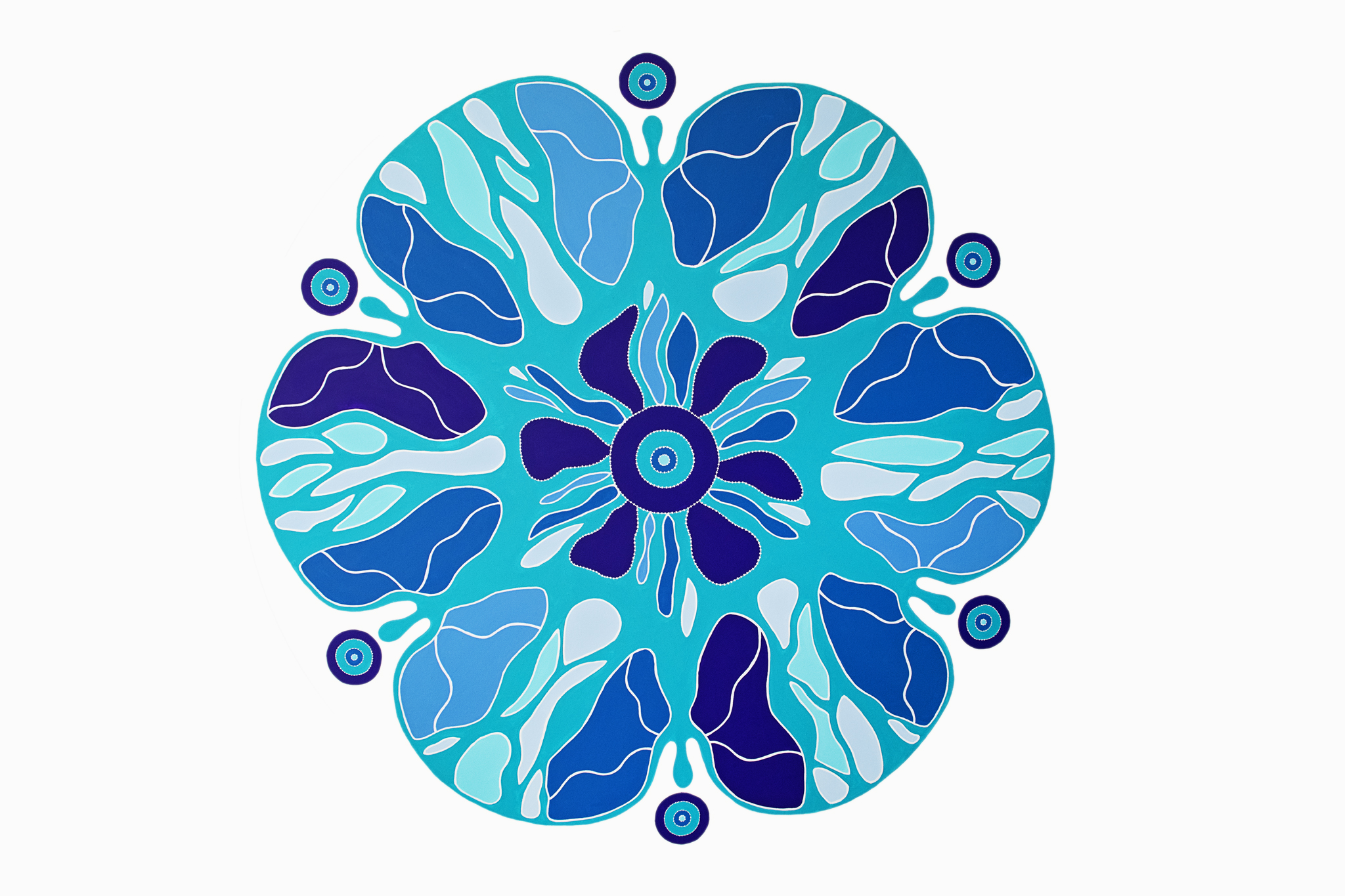
The brand has been designed to work in with the ‘Galbaan Wakulda’ artwork created for us by local Aboriginal artist, Birrbay woman Angela Marr-Grogan.
We received the artwork during NAIDOC Week in 2020 and from here we created our new brand that retains the pride of our 40 year history and reflects the beauty and deep meaning of ‘Galbaan Wakulda’ – Women As One in local Gathang language.
‘Galbaan Wakulda’ is a handcrafted custom acrylic on canvas work, symbolising women in unity and sisterhood.
It is a contemporary style of art, bold and symmetrical in design. It is a healing piece, and colour theory and meaning are integral to the design. Cool turquoise greens feature for healing, along with sapphire blues for trust. Both represent Liberty’s service delivery and core values. The piece also features the International Women’s colours of purple for dignity, green for hope and white for purity.
It is a feminine, nature-based piece with a floral aspect and a living, organic and cellular design to represent growth and transformation.
The women are depicted as butterflies linking hands to symbolise strength, growth, transformation and unity. This has a dual meaning and represents Liberty as an organisation, as well as our clients on their journey to overcome domestic violence.
Weaving our artwork into Liberty’s visual identity is an important element in our work towards reconciliation and symbolises our commitment to a future where all women and children are safe, empowered and respected.
Thank you to Angela Marr-Grogan from Cultural Industries for the beautiful custom artwork and Claire Briggs from Claire Briggs Design for working with us on our visual branding.
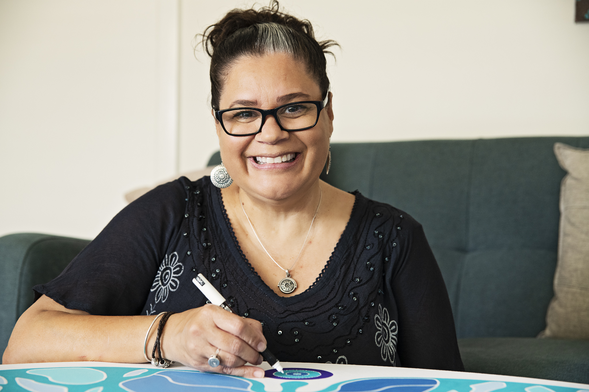
Artwork titled ‘Galbaan Wakulda’ by Birrbay Artist Angela Marr-Grogan (c)
 Other news